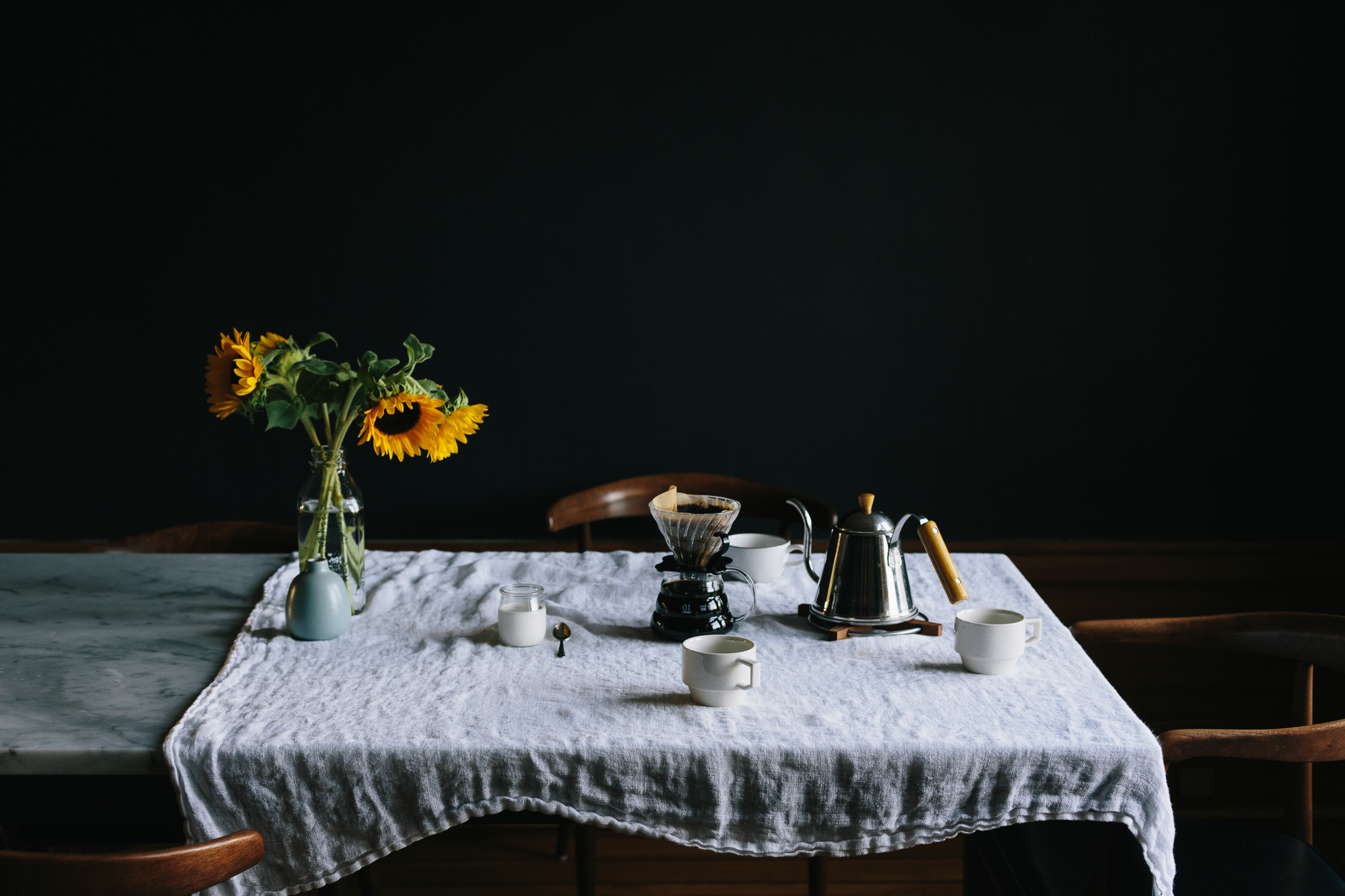
KTW London are an exciting PR agency/content and development consultancy whose aim is ‘connecting the culturally curious’. As someone with a keen interest in the arts it was lovely working with their creative and ambitious team as I saw eye-to-eye with them on design as well as content. Katy Wickremesinghe is the founder and she puts a lot of herself into the business so getting the site right was especially important and it felt like a very personal project. I am proud of the result and enjoyed the challenge of creating a bold site that had a wider colour palette than I would normally use.
Ipek Kotan - Website Design
Working with Ipek was amazing as her imagery was so powerful and it was also very consistent which allowed for a coherence across the site that is sometimes elusive.
The biggest challenge for this project was the timeframe - we had a few video calls and emails, prior to the build and domain transfer, but it basically all came together in under a week.


Concrete objects
I have been experimenting with making objects out of concrete.
Concrete is universal and for such a long time a took it for granted without considering it as a beautiful material brimming with potential. I started by wanting to make some aesthetically pleasing dumbbells. Concrete was the obvious choice so I bought the cement, marble dust and coloured gravel. Then I made a bunch of tests, experiments, mistakes and finally dumbbells !


Exhibition Photography
This year I have documented a few exhibitions for clients and friends.
Here are some of my favourite shots from this work:
Stephen Cox X Kallos Gallery: Ancient Stone


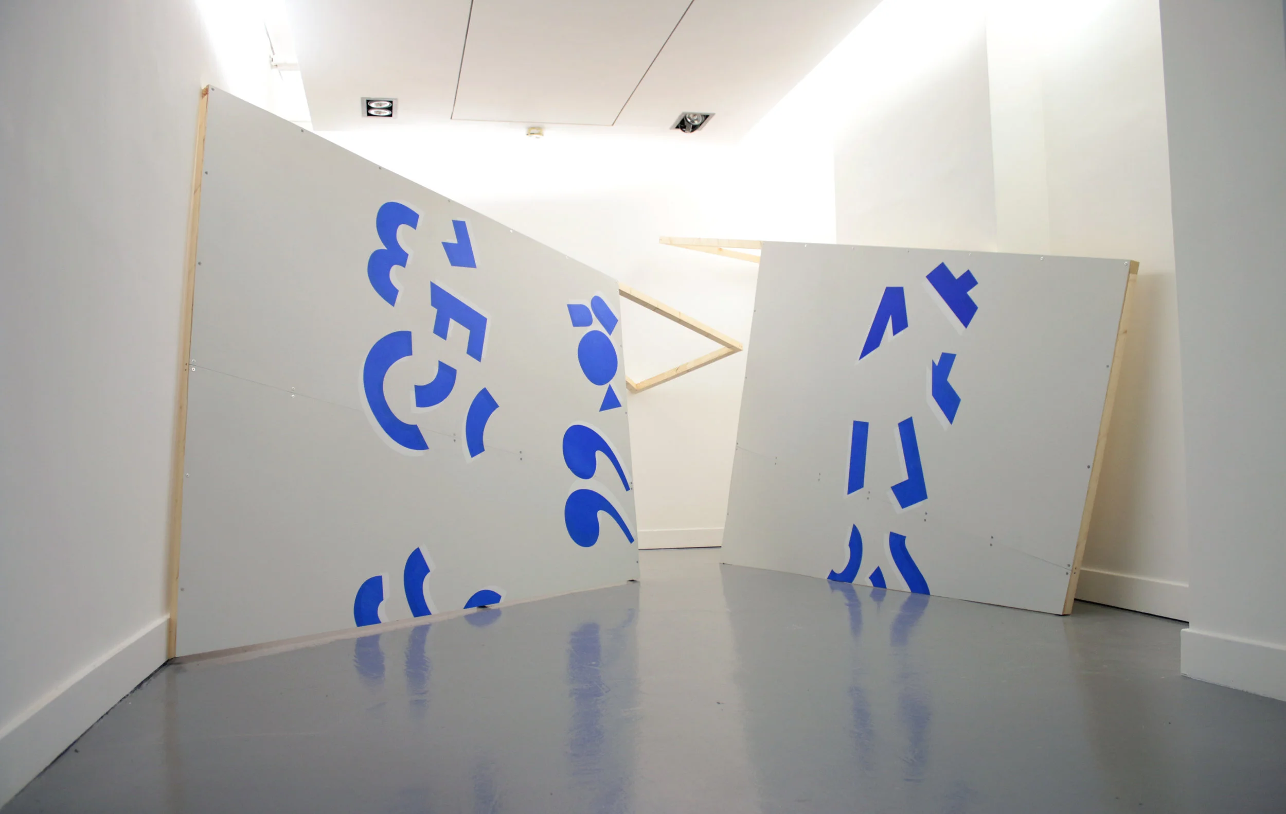
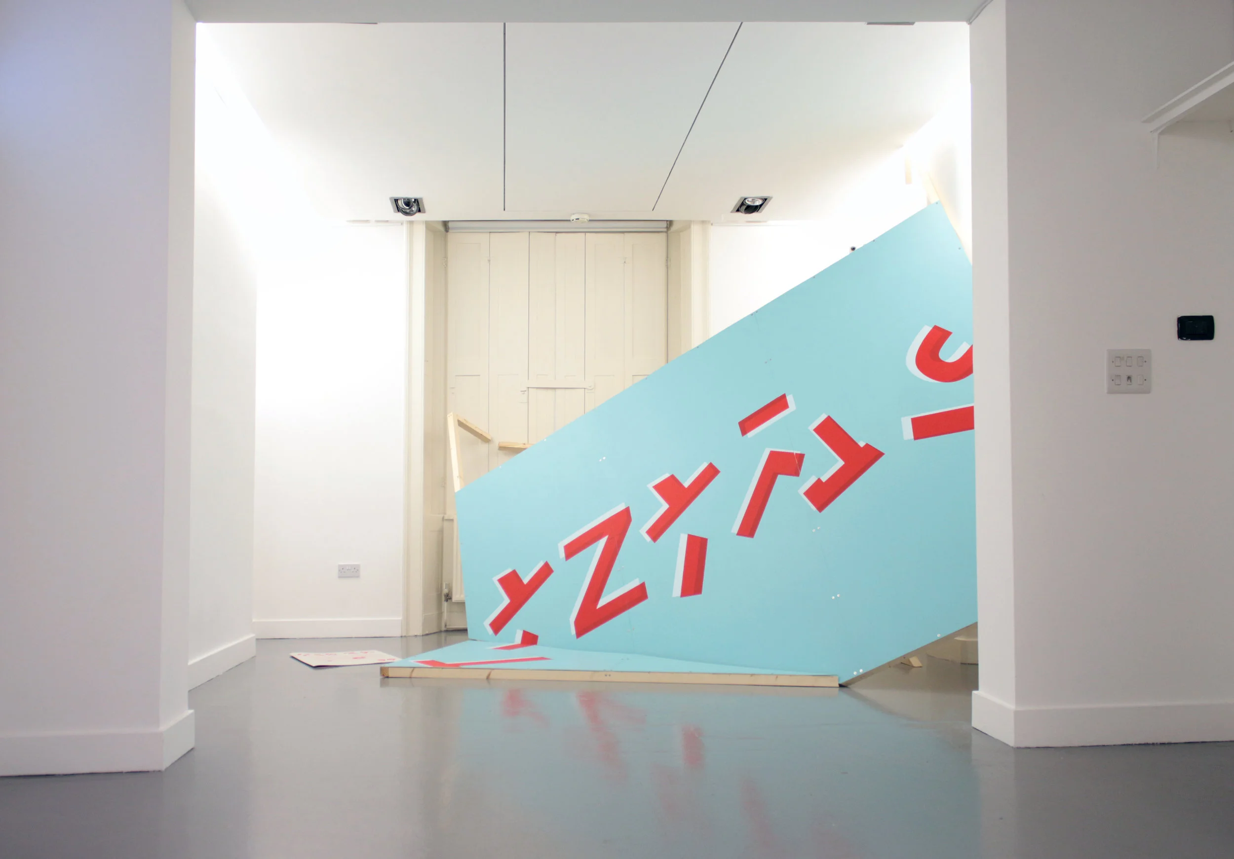
Language Strategies. A group show curated by Alice Woodhouse


Daniel Hunt Fine Art - Website Design

As an art history graduate it was great to work with Dan and his impressive stock of paintings. I did some of the photography on the site, but as there was so much to do the best thing to do was to hire professional photographer Renato Csatich who is a joy to work with.
I designed the logo and chose the background colour which is technically a super light greyish orange - it is really neutral and easier to balance than reddish greys. It provides a nice backdrop to the paintings that emulates either an cream wall or a printed page.

Art Fairs are Strange Places - Photobook
This is a photobook that I put together last year consisting of photographs that I took while working at art fairs in London and Europe.


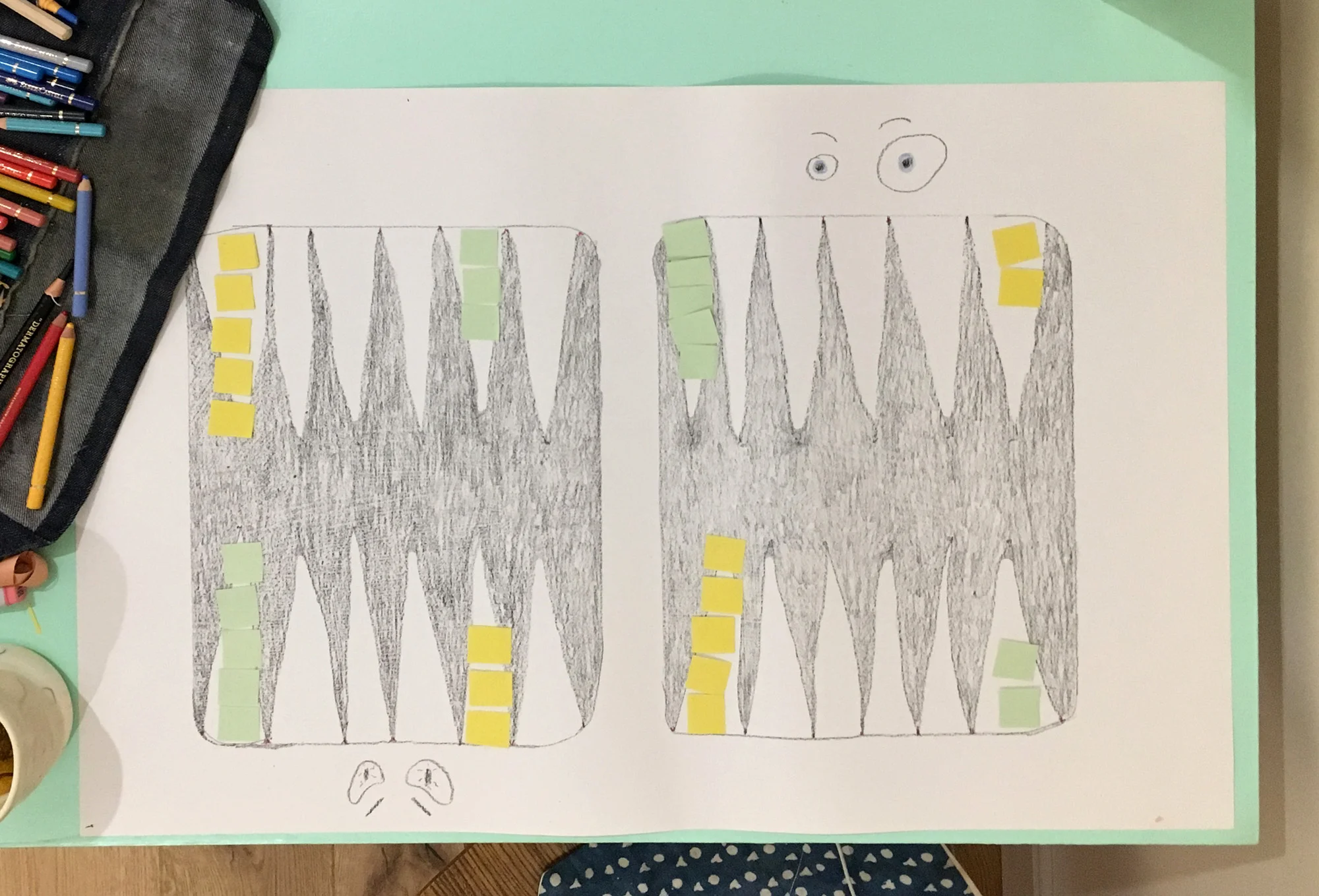
Backgammon boards
I recently got into backgammon, but I could not find any really nice (affordable) boards. The design is relatively simple so I had some fun making a few boards.
My aim with all of these was to make something that was beautiful in its own right and also functioned as a board. For the slate board I incised the marks using a weird kitchen utensil (some kind of shellfish shuck I think)…


Creative mounting: Mac Conner print
I love this print by the illustrator Mac Conner. The angular grid-like composition, high viewpoint, the colour palate it is a lot of fun. the title is: Let's Take a Trip Up the Nile and it was made for ‘This Week Magazine’, November 5, 1950.
When I came to framing it I thought the dynamic composition was actually a bit too much for the room. I also found myself drawn to the plants and the colours of the wall and staircase. Through selectively cutting out windows from the mount board the image changes from being a descriptive captured joyful moment to an ambiguous, potentially threatening scene. There is also a suggestion of narrative created through the revealed boxes that reminded me of aspect-to-aspect transitions as seen in Japanese comics.


The Old Rectory, Kettlebaston

Working with Maggie was a real treat ! I did all the photography and videography for the site over a long and sunny weekend. Getting the 'Rooms' page right was probably the biggest challenge - anchor links a photo-button menu was the solution.
John Whitehead - Website Design

The challenge here was that John wanted his site to feel modern, but not jar with the 18th Century porcelain that he deals in. The best way to do this was through using subtle effects such as the parallax scrolling effect on the home page and the almost exclusive use of serif fonts throughout.
